 |
|


 Jun 23, 2010, 12:13 AM // 00:13
|
#1 |
|
Desert Nomad
Join Date: Oct 2007
Location: Farming for Nick gifts
Profession: R/
|
 Shoop Artwork
I got bored and made a book cover for my guild. And now I've decided to make 1 photoshop art piece from a screenshot each week. I'll post a new picture every week.
This first picture was loosely based on one of my favorite book series, The Night Angel trilogy. The cover I made looks slightly like the cover from book 2. 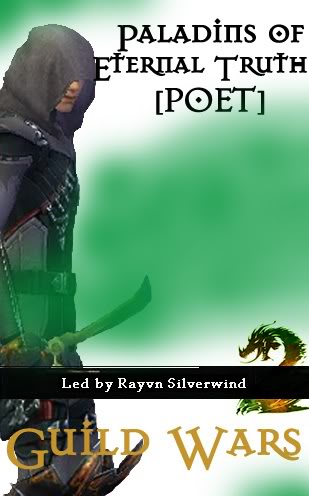 feel free to leave any criticism you have. Or better yet, ideas for what my next picture could be Last edited by RedDog91; Jun 23, 2010 at 12:58 AM // 00:58.. |

|

|
|
Jun 23, 2010, 12:29 PM // 12:29
|
#2 |
|
Forge Runner
Join Date: Feb 2007
Location: Las Vegas
Guild: Enraged Whiny Carebears [oR]
Profession: W/E
|
i have two completely legitimate questions. is this a serious thread? and did you make that in microsoft paint?
|
|
|
|
|
Jun 23, 2010, 04:30 PM // 16:30
|
#3 |
|
Lion's Arch Merchant
Join Date: Jun 2008
Location: In a chair
Profession: R/Mo
|
Cool, I like it. and go POET! (Gladiator Secrecy)
|
|
|
|
|
Jun 23, 2010, 05:08 PM // 17:08
|
#4 | |
|
Desert Nomad
Join Date: Oct 2007
Location: Farming for Nick gifts
Profession: R/
|
Quote:
And the 2nd question is answered about 3 times in the original post. And getting negative comments from someone whose posts are generally all negative is a compliment in my book because you took the time out to say something. Last edited by RedDog91; Jun 23, 2010 at 08:48 PM // 20:48.. |
|
|
|
|

|
Jun 24, 2010, 09:47 AM // 09:47
|
#5 |
|
Furnace Stoker
Join Date: Dec 2006
Guild: [Bone]
Profession: Mo/
|
Well, a few points of criticism..
First of all the 'Guild Wars' is kinda dull. I don't know what programme you use (I assume phtoshop?), but I would either give it an more yellowish outer glow or inner glow, or maybe even both, other otherwise just cut out the logo of guildwars from somewhere and use those letters. Secondly, the greenish thin you put in it. Its not bad, just (I assume you work in layers) put the layer where the greenish stuff is in, beneath the one with your assassin and the GW2 logo; it makes it stand out your assassin more (now the dagger he is holding is almost unnoticable). Thirdly try to render the main object in the work better (in this case that would be the assassin). Its cut out a bit pixy, you can see sharp corners everywhere. Using a eraser brush with lower opacity / lower flow, will make it alot smoother (just for the edges, for the rough errasing work just use full opacity and flow). Then secondly, duplicate the layer of the assassin, and change the layer effect of the top layer to overlay or multiply (whichever looks nicer) and then start playing with the opacity or that layer. This will gives you a smoother looking, bit darkenened and more alive looking work. Hope this helps, if you dont understand some terms I would be more then happy to explain them  EDIT: Quick thing I did to show you what I mean with the Smoother look and the Multiply layer. Dont mind some parts of the rendering, was done in 5 minutes  Last edited by Tommy's; Jun 24, 2010 at 10:10 AM // 10:10.. |
|
|
|
|
Jun 24, 2010, 10:21 PM // 22:21
|
#6 |
|
Desert Nomad
Join Date: Oct 2007
Location: Farming for Nick gifts
Profession: R/
|
Thanks for the criticism Tommy. I made a few more pics yesterday and did most the things you told me about. The only reason I didn't for the "cover" was that it was a little rushed.
The ones I made yesterday were a lot better. Almost to a point where I want to remove this first one. xD |
|
|
|
|
Jun 29, 2010, 10:52 PM // 22:52
|
#7 |
|
Desert Nomad
Join Date: Oct 2007
Location: Farming for Nick gifts
Profession: R/
|
been a week
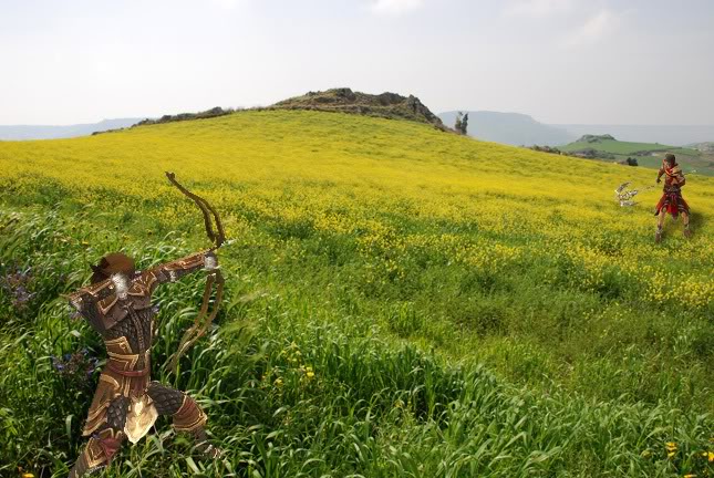 criticize it |
|
|
|
|
Jun 29, 2010, 11:14 PM // 23:14
|
#8 |
|
Wilds Pathfinder
Join Date: Nov 2008
Location: California
Guild: Lucid Spirits [LIFE]
Profession: N/A
|
Nice composition. However, the ranger needs shading. Right now, it looks like he's standing on top of the grass, not in it. The grass should be casting shadows on his legs.
While you're at it, I'd shop in an actual bowstring for him. That always bugged me about GW. Oh, and I would probably erase the rit's feet; they'd be buried in the grass. Mainly, just take a good look at the lighting and figure out where the shadows are; otherwise, the figures just look flat. |
|
|
|
|
Jun 30, 2010, 07:47 AM // 07:47
|
#9 |
|
Furnace Stoker
Join Date: Dec 2006
Guild: [Bone]
Profession: Mo/
|
That looks alot, alot better ^^ Very nice! A few points have already been made my Qing Guang; The boots of the ranger need shading, it should be alot darker there. For the Rt, indeed remove his feet a little. Besides I think you need a bit better picutere of him, I don't think its clear atm if he is standing (like Rit's can stand like no other
) or that is he's walking/running. Beside that indead remove his feet a bit. Lastly you could change the light of the Ranger and the Ritualist a little bit more yellowish, because of all the flowers, think they would blend in better then. But seriously alot better then the previous one, I especialy like the ranger. I always find it hard to find a suiting picture, but this one is nice^^
|
|
|
|
 |
|

«
Previous Thread
|
Next Thread
»
| Thread Tools | |
| Display Modes | |


 Linear Mode

|
|

All times are GMT. The time now is 05:28 AM // 05:28.
